KNN stands for K-nearest neighbors. KNN is a lazy learning algorithum, which is based on finding The Euclidian distance between different data points.
It does not assume any relationship between the features.
Open a new Python project, click copy button and paste the contents into the the first frame.
Run the code in the first frame.
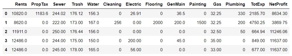
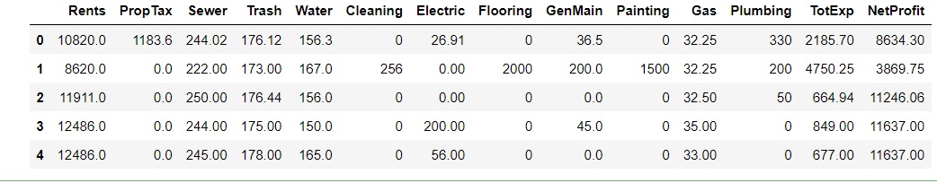
This code imports libraries from Python, reads in the spreadsheet file and prints the first five lines of it. Remember this is the same datset that we evaluated using the linear regression model.
You will have to adjust the location of the file in the code to your folder.
Your screen should look like the image above.
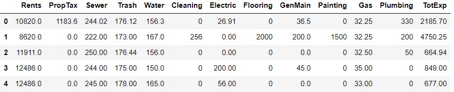
Click the + to add a new frame and paste in your code. Run the model. There is no output from these lines of code.
Click the + to add a new frame and paste in your code. Run the model. The output from these lines of code appears below.
Click the + to add a new frame and paste in your code. Run the model. There output from these lines of code appears below. It represents the randomly selected items and their associated projected net profits.
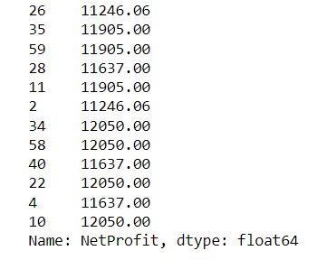
Click the + to add a new frame and paste in your code. Run the model. The output from these lines of code appears below.
These are the net profit predictions for the 12 randomly selected records.
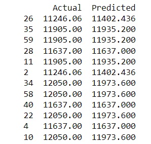
Click the + to add a new frame and paste in your code. Run the model. The output from these lines of code appears below.
This shows the actual data and the predicted amounts of net income. Take a look at the difference between actual and predicted amounts. How close are they? How do they compare with the linear regression model?
Click the + to add a new frame and paste in your code. Save and run the model. The output from these lines of code appears below.
Absolute Mean Error should be 59.07
Mean Squared Error should be 6249.23
Root Mean Squared Error should be 79.05
Day 3: Graphing the data
Let's see how we can visualize some of the data from our spreadsheet. First we are going to create a bar graph showing rents and their frequency.
The code appears below.
Click the + to add a new frame and paste in your code. Save and run the model. The output from these lines of code appears below.
Click the + to add a new frame and paste in your code. Save and run the model. The output from these lines of code appears below.
How do we interpret this graph?
For five months the monthly rents totaled $8,500
For five months the monthly rents totaled $10,500
For five months the monthly rents totaled $11,000
For five months the monthly rents totaled $12,000
For twenty months the monthly rents totaled $12,500
For twenty months the monthly rents totaled $13,000
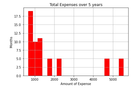
Now we are going to look at our expenses over a 60 month period and graph the results. The code appears in the box below.
Click the + to add a new frame and paste in your code. Save and run the model. The output from these lines of code appears below.
How do we interpret this graph of expenses.
For 18 months expenses were $900
For 10 months expenses were $1,000
For 11 months expenses were $1,200
For 5 months expenses were $4,800
For 5 months expenses were $5,500
For 5 months expenses were $1,600
For 6 months expenses were $1,783
If you total up the months, you will get 60 months.
The total of the expenses shown in the graph, total $109,598 wwhich is very close to the Excel total of $109,593.
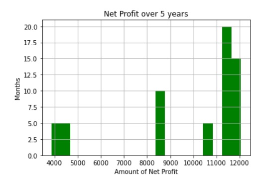
Now let's look at the net profit generated over the 60 months.
Click the + to add a new frame and paste in your code. Save and run the model. The output from these lines of code appears below.
Here is how you can interpret the net profit graph.
5 months at $4,000
5 months at $4,800
11 months at $8,800
5 months at $10,800
6 months at $11,500
10 months at $11,800
2 months at $11,950
15 months at $12,000
A histogram is a graph that shows the distribution of numerical data. It is a type of bar chart that shows the frequency or number of observations within different numerical ranges, called bins. The bins are usually specified as consecutive, non-overlapping intervals of a variable. The histogram provides a visual representation of the distribution of the data, showing the number of observations that fall within each bin. This can be useful for identifying patterns and trends in the data, and for making comparisons between different datasets.2
You do not get exact values because data is grouped into categories.
Examples
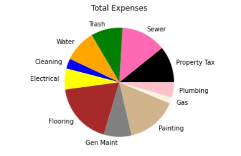
Now we are going to make a pie chart of all of the expenses. Here is the code
Click the + to add a new frame and paste in your code. Save and run the model. The output from these lines of code appears below.
The numbers in the np.array are the totals of these expenses from the Excel spreadsheet. When running the graphs, remember to start with the frame that loads in the libraries and the dataset.
If you want a legend for the pie chart, just delete the # in front of the codes.