Assignment 9:css information for small screen media query
Since we are designing this application with the mobile first approach, we need to key in the code telling the browser to format the data listed below the media query, only if the screen view port or browser window is 640 pixels or less. The query we are using is for 640 pixels maximum screen width which covers a number of cell phones in the landscape mode. The line appears below. Max-width means no more than and min-width means no less than. It is best to use the viewport in determining the media query since there so many devices on the market and using device-width would be a daunting task. Today it is difficult to determine the differences between laptops, tablets and phones. You may experiment with these breakpoint numbers if you wish.
@ media only screen and (max-width:640 px{
}
The first part of the file contains base style sheet information.
The box below contains the information necessary for formatting small screen sizes.
Open the student.css file.
Copy and paste this information just below the beginning base style text in the file.
Save the file as student.css
The } tag at the end of the entire css file tells the browser to format things between the { } tags.
We need to change the application from a three column layout to a one column layout due to the width of the viewport.
The section of the css3 file inside the media query needed for the #main section has been changed above to put all the text and pictures into one column instead of three. We changed the layout of all main elements:nav, article and aside to display in a single vertical column, instead of all three in a horizontal row.
Previous code: laid out in a row.
We have changed flex-flow:row; to flex-flow:column;
When using a small viewport of 640 pixels or less, we do not want to squeeze three columns into the space. This line takes all of the #main components: article, nav and aside and puts them into a single column.
The above change has been made for you.
Save the file as student.css
Open up the student.html file and replace the css3 file name in the link tag where it says template.css with student.css
Note the formatting tags for headlines and paragraphs for our small format.
We use smaller text and headlines in the smaller media queries and larger text and headlines in larger size media queries.
To get the picture in the header to appear, add the following just before the ending header tag. We added the following text.
We are adding the picture of a pirate ship inside the header and we want it to cover the entire area. The background-repeat statement tells the browser that we only want one copy of the picture to display.
The following lines were added at the end of your code for small formats for headlines and paragraphs.
There is also a section on formatting hyperlinks.
Save the student.css file
Run the student.html file.
When you run it in Notepad++, it will start in a desktop screen mode.
To see how it would look on a cell phone, drag the window to the left and when the screen size reaches less than 360 portrait mode pixels, it will appear the way you have designed it using the media query in the landscape view. Many phones display 360 pixels by 640 pixels. When held vertically, the width is 360 pixels and when turned sideways, it is 640 pixels, consequently 640 pixels is the maximum width.
To determine the screen size, click on the icon for the Responsive Web Design Tester on the Chrome browser window, and click on test screen.
The size of the browser screen will be displayed.
Click on the video link below to see how this works.
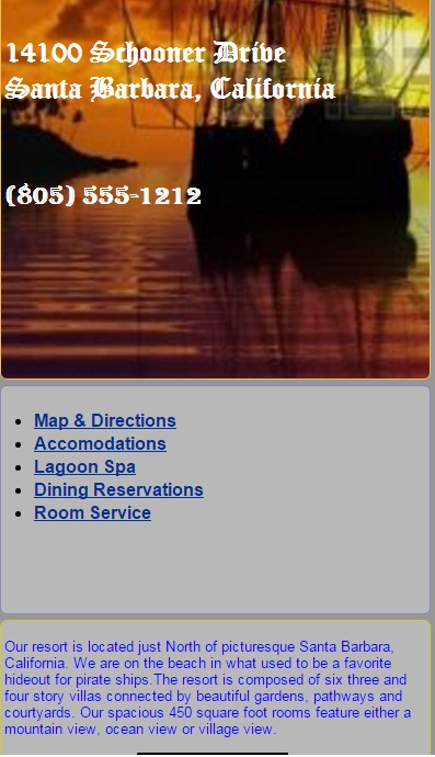
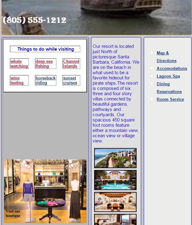
The finished product should look somewhat like the partial image below
Medium Screen Size
minimum width = 641 pixels
maximum width = 1024 pixels
Day 6
Assignment 10: css Code for a medium sized screen media query
As we look at a medium size format for our media query,it is a good idea to see what was used for flexbox attributes, headlines, paragraphs and links. The tables that appears below shows the current status for small screens. We will want to change some of these attributes for a medium screen like a tablet. Below are the changes that we will make after we key in the code for a medium screen query.
Text Formatting Attributes: small screen
Element
Size
Font Name
Font Color
Body
20pt
Helvetica
#969696;
h1
bold 60pt
Algerian
white
h2
bold 40pt
Old English Text
white
h3
bold 35pt
Algerian
white
p
15pt
Arial sans-serif
blue
Formatting Links: small screen
Link Type
Font Name
Weight
RGB Color
A:link
tahoma
18pt
(0%,19%,57%);
A:visited
tahoma
18pt
(89%,0%,13%);
A:hover
tahoma
18pt
(0%,0%,0%);
A:active
tahoma
18pt
(100%,75%,0%);
There are a few changes needed to the flexbox attributes to change over to a somewhat larger screen. A larger screen can now accommodate more than one column of text, like our original template. The #main attribute for the layout of the entire page needs to be changed to rows instead of a single column.
#main{
min-height:800px;
margin:0px;
padding:0px;
display: flex;
flex-direction:row;
}
Another change in the flex boxes has to do with the header. We want to put a different picture here. By changing the picture we can see when that screen size is reached when we drag the window. Change the name of the picture file in the header from piratescove3.jpg to ps2.jpg
in the medium screen size query.
How to proceed with making the changes for a medium sized screen format.
Open up the student.css file in Notepad++
Put the the media query for the medium format at the end of the small format code.
@media only screen and (min-width : 641px) and (max-width: 1024px){
Copy the all the text between the small screen media query tags using CTRL C to copy.
Paste the material just below the medium format query tag.
Key in the ending media query tag } at the end of the entire document.
Change the attributes for the flex boxes text formatting and link formatting
Save your student.css file
Test it using the Chrome Browser.
Drag the window back until you see the new picture in the header. That way you will know that this is what the page will look like on a screen between 641 pixels and 1024 pixels wide.
Change the size of the body text to 24pts from 20pts.
Change h1 to 65pt.
Change h2 to 45pt.
Change h3 to 40pt.
Change p to 17pt.
Change 18pt to 20pt for links.
Experiment with the colors if you wish.
Experiment with the colors of the fonts if you wish.
Add a logo to the footer by including the following lines in the CSS media query for medium screen sizes 641 X 1024
background-image: url(pirateLogo2.jpg);
background-repeat: no-repeat;
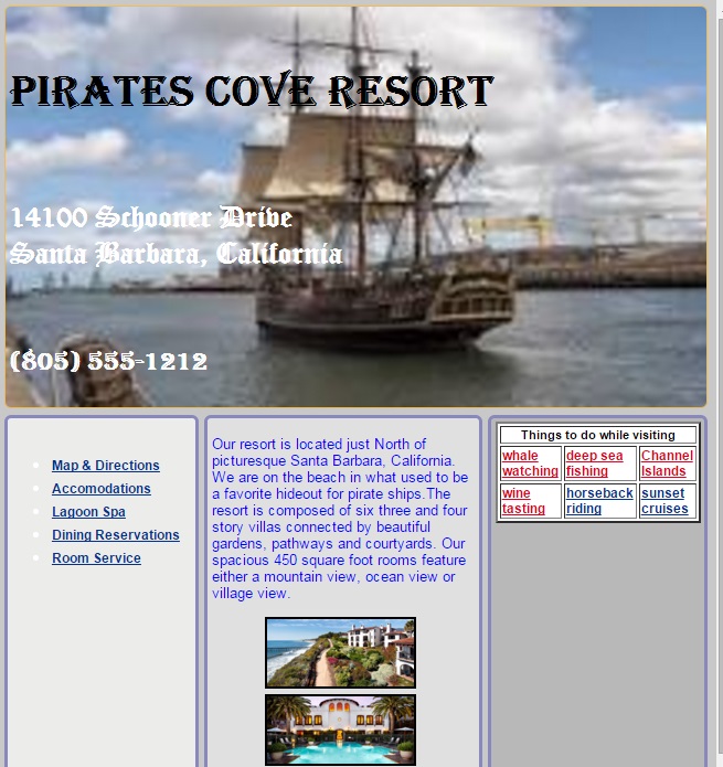
Your finished project for a medium-sized query,should look like the image below.
Day 7
Assignment 11
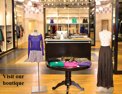
Since we have a larger screen we might want to add an additional picture. We might want the picture to appear only when the media query is set for a medium-sized screen. If we put the <img> tag in the html file, our picture will appear in all media queries. To remedy this, we will put the picture inside the css code media query for a medium-sized screen. In the example that follows, we will add a picture of our boutique to the aside section for a medium screen layout. Proceed as follows.
In your student.cssfile, add the following 3 lines to the end of the #main>aside section for a medium sized screen
The background-position tells the browser to position the object in the middle of the box and vertically down 90% of the height of the box.
You can use pixels to define the horizontal and vertical placement or words like right top, right center, center center, left bottom. See the table below for different positions for the picture.
Background Position Options
Horizontal
Vertical
left
top
left
center
left
bottom
right
top
right
center
right
bottom
center
top
center
center
center
bottom
You can also use pixels or percentages to set these parameters. For example, 0px 0px is the top left-hand corner. 25% 75% is: horizontal position 25% and vertical position 75% inside the flexbox.
Right-click the image of the boutique and save it as boutique2.png
boutique picture
You can also change the way the flexboxes are displayed on the screen. The Order attribute does this. Currently The <nav> box is displayed first, the <article> box is displayed in the second position and the <aside> is third. In the student.css file, change the order for the medium sized format to display aside flexbox first, the article flexbox second and the nav flexbox third.
Save your student.css file and then run the student.html file to see the changes. Your result appears below.