Getting Needed Files and Graphics for the Project
Day 1
Graphics needed for project |  |

| 
|
|---|---|---|
 |

| 
|
 |

|  |
 |
 |
 |
 |
 |
 |
 |
- Right-Click each image.
- Select Save image As from list
- Keep the file name the same, delete the parentheses and number inside before saving the file.
- If you pass your mouse over each image before saving, you will see what the file names should be.
- Make sure that the images are stored in the same folder as your flexible box model.
Getting the html 5 file for the flexible box model
- The first file needed is flexible box model template.html.
- The second file is called FBM.css
HTML5 code for the flexible box model template Code for FBM.css cascading style sheet
Getting the HTML5 File
Getting the Cascading Style Sheet File
- Using Notepad++ open the flexible box model template
- Click on Run and launch in Chrome, Internet Explorer of FireFox
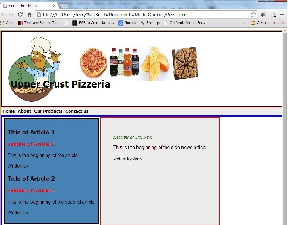
- Your screen should look like this
- As you can see, no formatting is being applied.
- That is because, the cascading style sheet file has not yet been linked.
- Find the lines in the html5 file - flexible box model template.html near the top of the text, that refer to linking the file to FBM.css.
- Do you see the <!-- and --> symbols. These comment out the link to the file.
- Remove these symbols , save the file and launch it in a browser.
- The html page after applying the formatting from the FBM.css file appears below.
What does our web page look like?
Understanding the layout style
Day 2
- Let's examine the layout of this flexible box model.
- The code is in the scrollable boxes just under the images of pizza, drinks, side orders and desserts.
- Remember the scroll box on the left shows the coding for the hTML5 file
- The scroll box on the right is the code for the style sheet file.
- This is only one example of a flexible box model and the different boxes can be arranged in a number of ways.
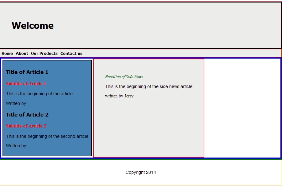
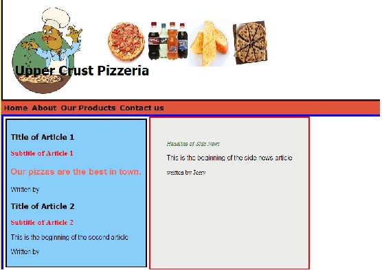
- There is an small orange border around the whole application. This is called the #big_wrapper
- The #body is a surrounded by a blue violet border.The body is the central area in the graphic.
- The #top_header has a black border and is located on the top of the page. It is means for company name, logo. Currently it has the word "Welcome" inside of it. It's color is gray.
- The #top_menu is a long narrow gray box with the navigational words listed: home, about, our products and contact us. It is the way we will navigate the site.
- The #top_menu li is part of the top_menu box. It is used to display our navigational words as an in line list.
- The #new_div is a major break in the page. It separates the top half from the bottom half of the page, It is outlined in a blue border.
- The #main_section is blue and has a 3 pixel black border around it.
- #side_news is the column on the right. Its background color is gray.
- #the_footer is meant for copyright and contact information. It is has a top, green border .
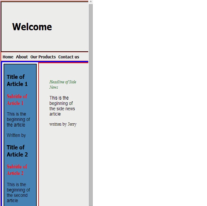
Seeing What the flexible model does.
- Drag the screen to s smaller size and see what happens.
- Each flexible box should change in size and push its contents down.
- Boxes that are not flexible do not flex. Header. Menu and footer do not flex.
- Below is an example
Code for Flexible Model Template File
Explaining the code in the layout tags
Day 3
- Let us examine the html5 code in this flexible box model template
- The first line <!DOC TYPE html> identifies this file as HTML5 as opposed to earlier versions
- The next tag sets the language to English
- The < Meta char set="utf-8"/> tells the browser which character set to use.
- The title is next. Note beginning and ending title tags. Titles are used by search engines to find your site.
- The big_wrapper, body, top_header, top_menu, top_menu li, main_section, side_news, the_footer are all sectioning elements that tell the browser how to layout the page.
- These actual sections appear in the html part of the document.
- If you scroll down through the code above to the <body> tag you will see these sections listed below,
- Other tag format headlines, special paragraph styles.
- A very important line links the html sheet to a cascading style sheet file
<Link Rel="StyleSheet" href="FBM.css">
The Style Sheet file is listed above and below. It is called FBM.css The instructions in this file, tell the html page how to look in terms of color, fonts, margins, borders, images, size of box - fixed or flexible.
HTML5 code for the flexible box model template Code for FBM.css cascading style sheet
- Let us examine the structure of a style sheet tag in the FMB.css file.
- #big_wrapper is the name of our first section. It represents a large box the encircles the entire web page.
- The curly braces encompass the properties.
- The left one { begins the list of properties.
- The right one } end the list of properties.
- Be extremely careful when using them. It is easy to forget one or end up with too many.
- When making a style sheet , I type the first brace and then immediately type the second brace. Then backup a space and press enter a number times to leave room for the formatting descriptors.
- Next you set the properties for this sectioning element in terms of pixels width, margins, borders.
- The line that states display:flexbox; indicates that this layout flexes and is not static.
- The body is also a flexbox with a blue violet border around it.
- The #top_header is a light gray with a black background. Currently the word Welcome is in the box. It will be used for our company name and logo and other images.
- The top_menu is the area where our navigational text goes to get to other pages - links to other parts of our web page. It is also gray in color. black text with a red border.
- The #top_menu li contains the formatting codes for our navigational system. It is laid out as a inline-block, with 14 pt Tahoma font for the text. The list style is none. This refers to bulleted or numbered items in a list. We do not want them here. The padding refers to the spaces between the words - Home-about, etc.
- The #new_div is a major formatting code, which divides the top half from the bottom half of our page. It is a flexible element
- The #main_section is blue with a black border and contains two articles, their headings, subheadings and footers.
- The #side_news is gray with a red border.
- The #footer has a top border which is green. If there were in here, it would be left aligned.
- The other formatting codes as you can see form the coding above, deal with headlines, special paragraph formatting, emphasising text.
Making changes in CSS3 code - file FBM.css
Day 4
We are going to change background images, add the company name to the top header, background color of top_menu, change the font of menu list items, change background color of main_section, use the paragraph p.special class to emphasize text.
- Let's make some changes in the styling code of our page so we can better understand how it works.
- Remember to save the file after making changes. Then test by clicking on the HTML file name, RUN and then launch in the browser of your choice.
- Do not run the CSS3 file. You want the html5 file. No harm will come, however, I have made that mistake many times.
- To make changes in the background images in the header, follow these steps.
- You can use the graphics that I have provided for you or choose your own.
- If you choose your own, select a graphic you want to use. Remember that this is a pizza place.
- Save it in your work folder.
- It will probably need to be resized.
- Microsoft's Paint program which is in the accessory group that goes with Windows. works well for this. You may, however, use any program you wish to resize the image.
- In Paint, here are the steps.
- All Programs
- Accessories
- Paint
- When paint loads, Open File
- File Name
- Enter name of picture file you want to resize.
- Open
- Resize icon - click.
- Click Radio Button to change to pixels.
- Uncheck maintain aspect ratio box.
- Use 100 pixels for horizontal and 117 for vertical size.
- Click OK
- File - Save As .jpg
- Select work folder.
- Click Save.
Changing the background Image
- Locate the #top_header section in your CSS3 code again
- The background color is #d3d3d3 which is a light gray. Currently there is no background image.
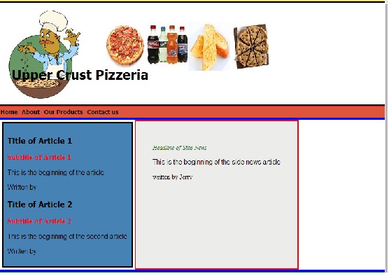
- The background color of the big_wrapper is a pumpkin color or dark gold.
- Locate the #top_header section in your css3 file.
- Replace the this section with the following code.
- Use Save As to save the css3 file under a different name. Call the fileUpperCrustFull.css
- We need to change the link now in our HTML file. <Link Rel= "StyleSheet" href="UpperCrustFull.css">
- Save your html file.
- Now run and launch your Pizza.html file in your browser.
- How did it look?
- Was it the image in the correct position? The first number for each image, is the horizontal position of the image, the second number is the vertical position in pixels.
- The no-repeat tells the browser not to repeat the picture a bunch of times.
- When using a background image tag, the background color is pre-empted and will not show, but the big_wrapper color is still there.
- As you can see, you may use multiple images in your background. Just remember to space them out.
- Remember if you want multiple background images the first ones are followed by a comma instead of a semicolon, which is reserved for the last image.
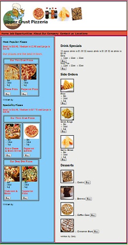
- These images that appear above have already been resized and as you can guess; show the company logo, picture of a pizza, drinks, side orders and a big cookie.
- You will also note, that the word "Welcome" is also in the top header. You should change it to the name of your company, which is Upper Crust Pizzeria. Remember this text is in your html5 file.
- Here is what your Pizza.html file should look like after it is linked to your UpperCrustFull.css file.
Changing the background color of the #top_menu
- Locate the #top_menu section in your cascading style sheet file UpperCrustFull.css.
- Currently the background color is #eceacea which is a very light gray. Replace it with #de553c; which is a reddish orange color.
- Save file
- Launch html file in browser.
- The box that surround the menu choice of Home, About, Our Products and Contact Us should be reddish orange.
Changing the font in the #top_menu li
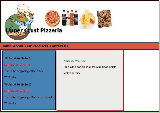
- Locate the section #top_menu li in your CSS3 code.
- Currently the font is bold 14px tahoma;
- Change this to bold 18px Verdana
- Save and Test
- The padding represents the space between the words. Experiment with padding number of pixels to get correct spacing of menu items.
Changing the background color of the #main_section.
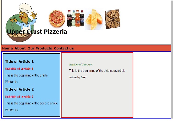
- Change the color of the main section to #87CEFA which is light sky blue.
Using a special paragraph tag to emphasize text in your documents.
- Find the section of styling code that says p.special in your style sheet file.
- As you can see the font family is tahoma, font-size is 14px, the color of the text is #a9a9a9 and it is bold.
- Change the font name to Helvetica, size 16px and #ff6347 which is tomato.
- Save file
- Now in the HTML code locate <Article>. it is just beneath the <section id="main_section">
- We want to apply this special paragraph style to the sentence that says This is the beginning of the article.
- Key in <p class="special"> in front of the sentence. Put the ending tag on the end of the sentence, </p>
- Change the sentence to say Our pizzas are the best in town.
- Save it and test it.
- Experiment with different colors fonts and styles until you are comfortable with this concept.
- Notice that there is also a paragraph style called p.large
- You can easily create these classes for your own sites. Just follow the procedures outlined above.
- Remember you need to work in the CSS file to define the formatting and the html file as to where you want it placed.
- Come up with a pleasing color scheme. You can change background colors and borders.
Adding HTML code to make page a pizza parlor
Day 5
CGI Script for Form Mail
- The next line that needs to be added is one that calls a CGI script on the server.
- You will need to contact the folks that host your site for this script.
- For now insert my script into the HTML code just after the beginning body tag.
<Form name="Form" action http://www.janetbelch.com/cgi-pub/formmail/method=post>
- This script sends me an email with the results of the customer's order.
- You can also use the MailTo tag. See other web tutorials on this site for the code.
- Do not try to test this yet as there is more coding to be done later.
Menu
- Now we need to make changes to our navigational menu.
- We are not going to make them operational, but we need to change the appearance of our mobile application.
- Look through your html code section for the <Nav id = "top_menu">
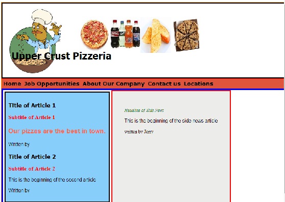
- In the listing of menu options replace About with Job Opportunities
- The Home choice remains unchanged
- Replace Our Products with About our Company
- Create a menu item for Locations
- Save file and run Pizza.html.
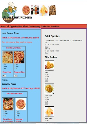
Organization of the page
- This mobile application page is organized in the following way
- The top header contains the logo, company name and pictures of some of our products.
- There is a top menu where our navigation links are placed
- The main section contains two articles and a side news. All are flexible boxes
- The first <Article> is reserved for the most popular pizza offered by Upper Crust
- The second <Article>: is for Speciality pizzas.
- The #side_news is reserved for drinks, side orders and desserts.
- The footer is where we will put customer and delivery information.
- You will place your HTML code in each of these areas.
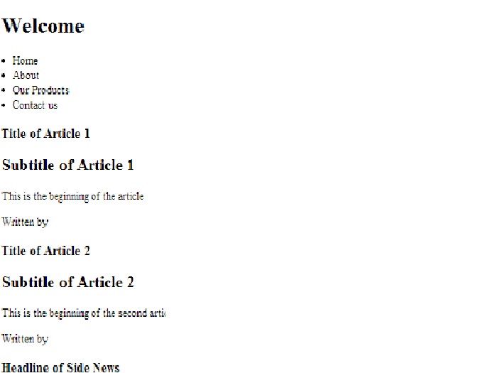
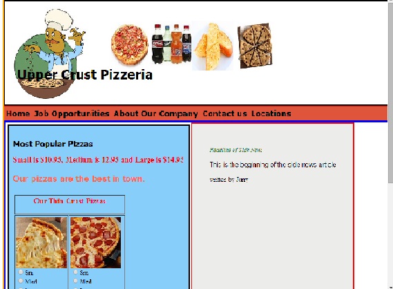
- Locate <h1>Title of Article 1
- Replace the headline text with "Most Popular Pizzas"
- Replace <h2>Subtitle of Article 1 with "Small is $10.95, Medium is 12.95 and Large is $14.95"
- Save and test
Table with images and pizza choices
Article 1: Most popular pizzas
- Now we are going to put into the HTML section a way for our customers to order on line our pizzas
- We will present the data in a tabular form.
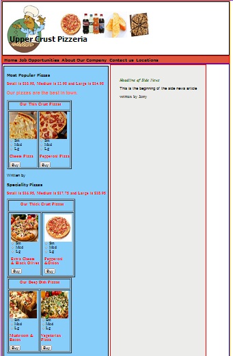
- Our first most popular pizza is just cheese.
- First we create a table with cell spacing 3 cellpadding of 3 and a border of one pixel with the following code.
<Table cellspacing=3 cellpadding=3 border=1> - Next, we create a heading for our table
- The single table data cell <td> contains the <img src> tag for the picture its height and width and a title that appears when the user passes the cursor over the picture. a <br> makes a break before the radio buttons which are used to select the size of the pizza desired.
- When the table data is completed it is followed by an ending table data tag, <TD> a </TR> and and ending table tag <Table>.
- The input type button line of code,makes a button on your screen and the word "Buy" appears in it
- When the user clicks on it calls a javaScript function in our javascript file called Checkout3.js
- The code in the javaScript code calculates the cost of the order.
- We will look at that file a little later.
- Copy the information below for Thin Crust Pizzas and paste it into the HTML file, just after the ending <p class="special"> tag for article 1
- Save and test html file.
- This is what your html file should look like after this change.
Headlines for Article 2
- Locate <h1>Title of Article 2 in your Pizza.html file
- Replace the headline text with "Speciality Pizzas"
- Replace <h2>Subtitle of Article 2 with "Small is $16.95, Medium is $17.75 and Large is $18.95"
- Delete the line that states is the beginning of the second article.
- Save and test
- Copy the information below for Thick Crust Pizzas and paste it into your HTML file, just after the previous table for thin crust pizzas.
- Save and test
Table with images and pizza choices
Article 2: Speciality Pizzas
Drinks
- Replace Headline of Side News with <h1>Drink Specials</h1>
- Delete <P>This is the beginning of the side news article<p>
- Copy and paste the information about drinks right after </header>
- Within a group of radio buttons, only one can be selected.
- The radio buttons are used for the customer to select the size of cola drink they want.
Side Orders
Copy and paste the information about side orders just under the section on drinks.
Desserts